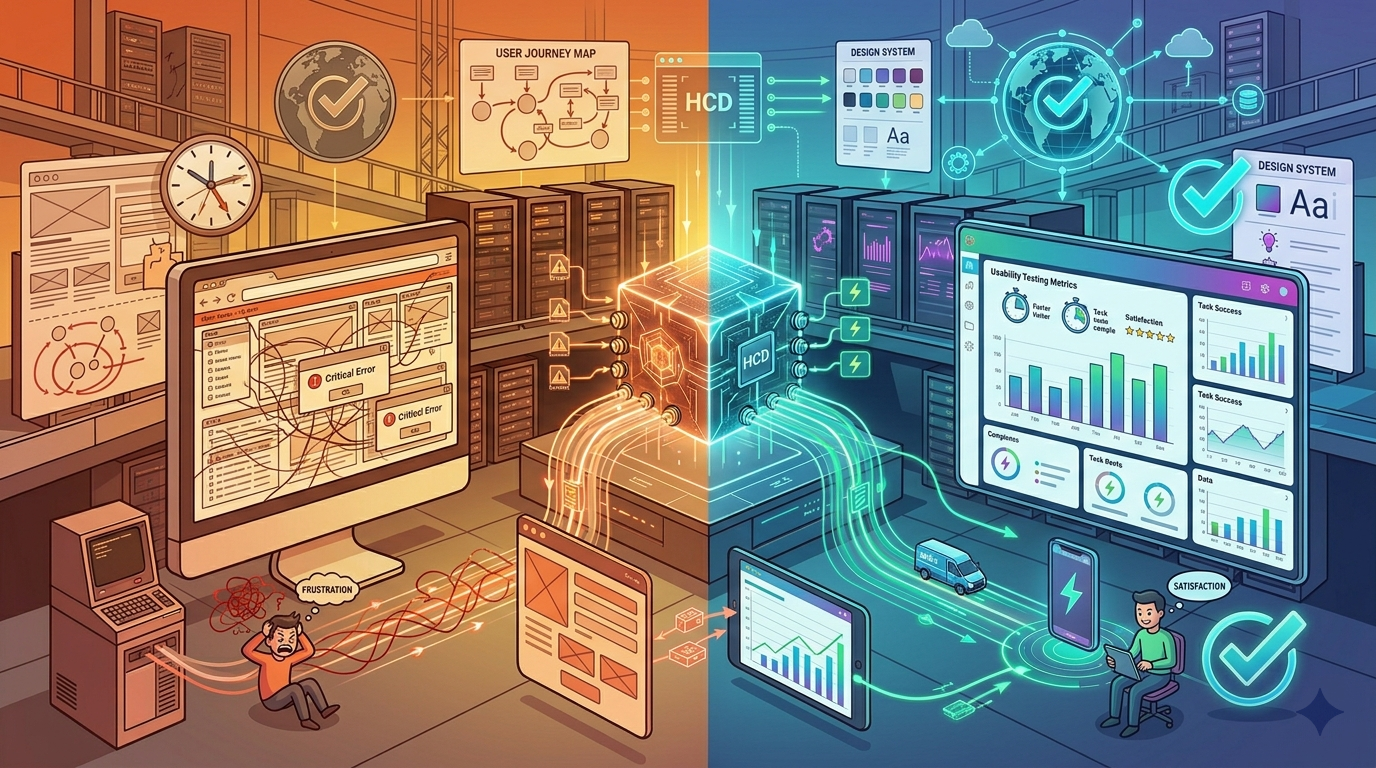
The Solution: Comprehensive Human-Centered Design Overhaul
Spundan deployed a full UI/UX transformation program, combining deep user research,
iterative prototyping, and a scalable design system to rebuild the entire platform:
-
User Research & Discovery: Conducted 120+ contextual inquiries
across 15 hospitals, shadowing clinicians during shifts to understand real workflows,
pain points, and cognitive load patterns.
-
Persona & Journey Mapping: Created 8 primary user personas
(physician, nurse, pharmacist, biller, administrator) with end-to-end journey maps
identifying 200+ friction points and opportunities.
-
Information Architecture Restructuring: Redesigned navigation
hierarchy based on task frequency and clinical priority — reducing main navigation
from 40 items to 8 core sections with intelligent defaults.
-
Unified Design System: Built a comprehensive design system (Figma
library with 500+ components) including color system (accessible contrast ratios),
typography scale, spacing grid, icon library, and interaction patterns — ensuring
consistency across all modules.
-
Task-Optimized Workflows: Redesigned 50+ critical clinical workflows
(order entry, lab review, discharge summary, medication admin) reducing average
clicks by 65% through progressive disclosure, smart defaults, and batch operations.
-
Alert & Notification Redesign: Reimagined clinical alerting with
hierarchical urgency (critical/warning/info), visual prominence, action-oriented
messaging, and interruptive patterns only for life-critical events — reducing
alert fatigue by 70%.
-
Mobile-First Responsive Design: Designed and tested responsive
interfaces for tablets and phones, enabling mobile rounding, bedside documentation,
and secure messaging — previously impossible.
-
Accessibility Compliance: Audited and remediated all interfaces
to meet WCAG 2.1 Level AA standards — keyboard navigation, screen reader support,
color contrast, focus management, and ARIA labels.
-
Usability Testing Program: Established continuous testing with
50+ clinicians weekly, using moderated and unmoderated tests (UserTesting, Maze)
to validate designs before development.
Results
The UI/UX redesign delivered exceptional improvements in clinical efficiency,
user satisfaction, patient safety, and business metrics:
-
Task Completion Time: Average task completion dropped from
4.5 minutes to under 1 minute (78% reduction) — saving clinicians
90+ minutes daily.
-
User Satisfaction: NPS score improved from -42 to +64
— a 106-point swing, with 94% of clinicians rating the new interface "excellent"
or "good."
-
Error Reduction: Data entry errors reduced by 89% —
from 1,200+ monthly corrections to under 130, saving $1.8M annually in rework.
-
Alert Fatigue: Non-critical alerts reduced by 70%
through better prioritization, while critical alerts saw 100% acknowledgment
rates (up from 62%).
-
Training Time: Clinician onboarding dropped from 6-8 weeks to
3-5 days — saving $2.1M annually in training and productivity costs.
-
Mobile Adoption: 3,200+ clinicians now use mobile tablets
for bedside documentation, eliminating 45 minutes of after-shift charting daily.
-
Accessibility Compliance: Platform achieved WCAG 2.1 AA
certification, eliminating legal risk and enabling access for 200+ users
with disabilities.
-
Clinical Safety: Zero medication errors attributed
to interface confusion over 18 months — previously averaging 2-3 near-miss
incidents monthly.
-
Financial Impact: Delivered $6.3M annual savings from
productivity gains, error reduction, and lower training costs — exceeding
ROI targets by 210%.
Conclusion
The UI/UX redesign proved that human-centered design is not just about aesthetics —
it's a strategic investment with measurable ROI in productivity, safety, and
satisfaction. By deeply understanding clinical workflows, applying rigorous design
methodologies, and building a scalable design system, Spundan transformed a hated,
dangerous legacy interface into a beloved platform that clinicians actively advocate
for. The redesigned EHR now serves as a competitive differentiator for the healthcare
provider, driving user adoption, reducing operational costs, and most importantly —
enabling better patient care. The design system continues to evolve, with 50+ new
features launched in the first year, all maintaining the same high standards of
usability and accessibility.